T-Mobile approached GLG to design the payments flow within the My T-Mobile App. T-Mobile customers barely used the mobile app at the time because of its limited functionality. T-Mobile wanted to increase app usage to collect valuable customer data and increase customer loyalty. Paying phone bills with the app was identified as one of the most important functions needed to increase adoption.
T-mobile used mobile-optimized customer portal website pages within the app to temporarily allow customers to make payments. Since the flows were not optimized to be used within an app, it led to user frustration and several calls to T-Mobile customer service.
Our high-level goals included:
I was the lead UX designer on the project. I worked with a GLG project Manager, T-Mobile stakeholders, business analyst, and their usability research team to design the payment experience.
Research and Stakeholder Interviews
The product owner provided us with past research that collected feedback from the customer service team. In addition to the survey, I met all the stakeholders at T-Mobile to get a good understanding of their goals and concerns.
My goal was to understand the challenges that customers face while making payments and the workarounds they employed. Insights gained from the research and stakeholder conversations were not surprising:
Designing the experience
After learning about the issues that customers faced in the existing flows, I started by identifying the key flows related to making payments.
Brainstormed Multiple Design Options
I designed a wide range of possible design solutions for the payment user flows. Information was displayed in different ways in each of the solutions. During this process, I worked with a T-Mobile designer, the product owner and T-Mobile stakeholders to evaluate various approaches against our goals, which led to additional iterations.
[tw-toggle title=”What are the payment methods available to customers?”]
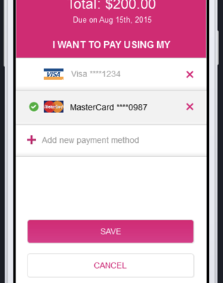
 Customers can make a payment using their credit or debit cards, or pay directly from their bank checking account. We also added the ability to autoscan a credit/debit card, instead of entering the information manually.
[/tw-toggle]
Built a clickable prototype
I put together an Invision prototype that was used by the product owner to develop a consensus among stakeholders at T-Mobile. T-Mobile researchers also used it for a usability study to validate our approach.
[tw-button size=”medium” background=”” color=”” target=”_blank” link=”https://invis.io/96QMBWG3NK7″]View Prototype[/tw-button]
 T-Mobile’s usability research team conducted an in-house usability study with the latest design and compared it with the existing design. The study was performed using an online Invision prototypes with 5 users. The final designs were created using the study findings.
The new design was unanimously preferred by all test participants.
Key findings included:
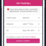
 Adding a terms & conditions note to indicate that the payment will be submitted once ‘Submit’ is selected
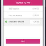
 ‘Save’ CTA was unclear in the task of changing the dollar amount to be paid. Will the system ‘Save’ each time going forward? We changed the language to ‘Done’.
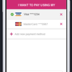
 Added radio button to change selection. Users were confused if tapping a row would take them to the next screen (a level deeper) or help make a selection.
The usability test enabled me to evolve the product to better fit the needs of T-mobile customers. I made refinements based on the usability findings. The payment flow was launched in the beginning of 2016. The ‘Pay your bill’ feature is one of the most widely used features in the app. The feature’s ease of use has been called out as one of the highlights of the app.